


UI/UX Design: Process, Principles & Significance Guide


UI/UX design is the process that makes websites/applications effortless for users to navigate. UI defines design elements which make the product look good, while UX focuses on how it works and how people browse through it.
The design process includes phases such as- research the users, defining the problem, brainstorming ideas, wireframing, gathering feedback, and finally developer handoff.
This helps users complete tasks faster and increase product adoption rate.
Take three high-performing apps from this year as examples: ClearTax, Google Maps, and IKEA. They stand as testaments to how thoughtful UI and UX design in digital products can transform complexity into clarity, friction into flow, and uncertainty into confidence.
In ClearTax, India’s premier fintech platform, users would feel it difficult when they face complex tax terms and confusing screens instead of intuitive navigation architecture and simplified, persona-based user journeys – an example of how effective fintech UX design trends transforms complex services into seamless experiences.
Without Google Maps’ mastery of visual hierarchy design and its careful use of data visualization in UX, we would all suffer from “eye fatigue” and information overload every time we looked up a location.
The IKEA app’s immersive 3D AR feature that has solved the age-old furniture-buying dilemma of “Will this piece of furniture fit in my room?” would be useless without great UI UX design.
Each of these apps was built on its own set of unique UI/UX design strategies. Without them, these apps would be just like other flops in the endless catalog of digital products, forever ignored by hesitant shoppers.
To understand why great design drives real product success, explore the key benefits of UI UX design for modern digital businesses.
This blog post is your ultimate blueprint for mastering UI/UX design. Whether you are a startup founder, a SaaS developer, or any brand marketer looking forward to hiring UI/UX design agencies, reading this blog post will equip you with everything you need to know about the secret sauce that powers all successful digital products.
We’ll decode the importance of UX design in business, highlight emerging UI UX trends, and dissect key concepts like the aesthetic-usability synergy.
Let’s dive in.
What is UI/UX Design?
UI/UX design is the dual discipline of creating digital products that are both visually engaging (UI) and functionally intuitive (UX). It takes into account every possibility of every action the user is likely to take while interacting with software, apps, or websites.
Then, it combines principles from aesthetic design, user-centered psychology, and technology to optimize each interaction for maximum satisfaction.
While often used interchangeably, UI (User Interface) and UX (User Experience) design are two separate fields that address different aspects of the product design process. But, to make a product that consistently delivers good experiences, both of these fields must work in conjunction.
What do we mean by good experiences?
UX pioneer Peter Morville outlined 7 pillars of a good user experience: useful, usable, findable, credible, accessible, desirable, and valuable. For instance, a mobile banking app’s goal is to help users transfer funds fast with minimal effort.
This app might feature clean, professional typography for clarity and a one-click payment process for efficiency (aspect of UX design). Unless you get both of these aspects of the design process right, you do not have a successful mobile banking app that has all of these 7 qualities.
The importance of UI/UX design lies in its ability to transform complex digital functionalities into useful, usable, findable, credible, accessible, desirable, and ultimately valuable tools.
What is UX Design?
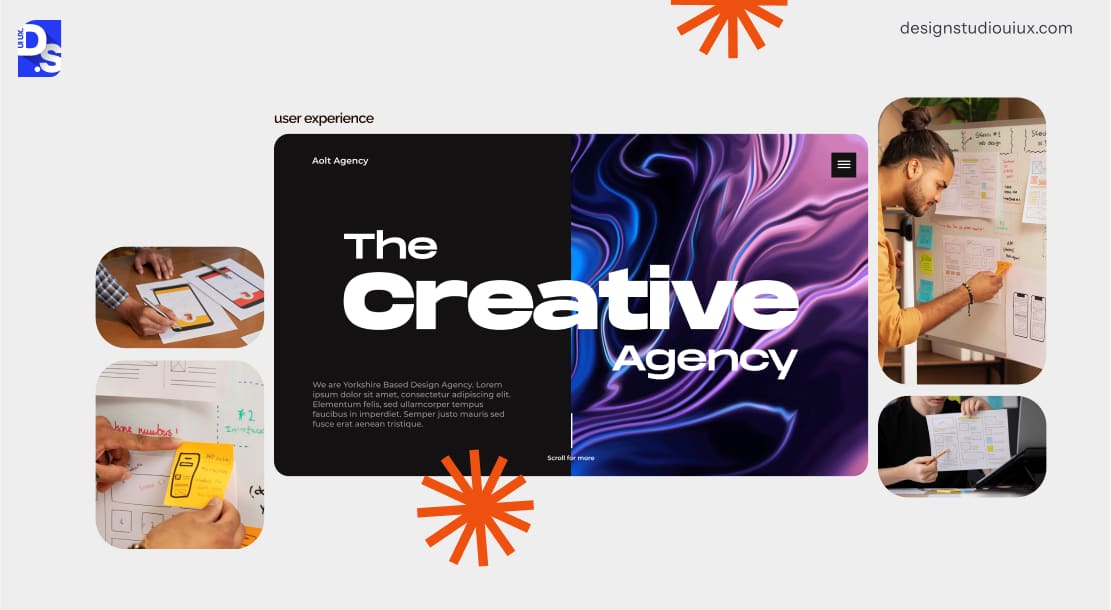
UX design is the process a team follows to make using a digital product feel intuitive and easy. It covers simplifying navigation and user journey. It mainly focuses on the function of the product. Here, the main goal of designers is to solve usability problems to ensure a frustration-free journey.
All the steps that a product team takes to make every interaction a user has with their digital product more useful, usable, accessible, desirable, valuable, and meaningful fall under the umbrella of “UX Design.”
This field looks at the whole experience a user has with a product, from first finding it to using it for important tasks. UX designers make sure each step is easy, smooth, and enjoyable so users want to keep using it.
They do this by learning how people use the product, planning the steps users take, and then improving those steps to make things simpler and more satisfying.
For instance, to have great SaaS UX design in a project management tool, you have to make every login page, every onboarding flow, every dashboard, and other in-app features intuitive enough so that first-timers can use it without training.
To do so, UX designers have to study the people who use the tool, empathize with their specific needs, study other project management tools, and more. After creating appropriate user journeys, they need to continuously refine those journeys based on user feedback.
What is UI Design?
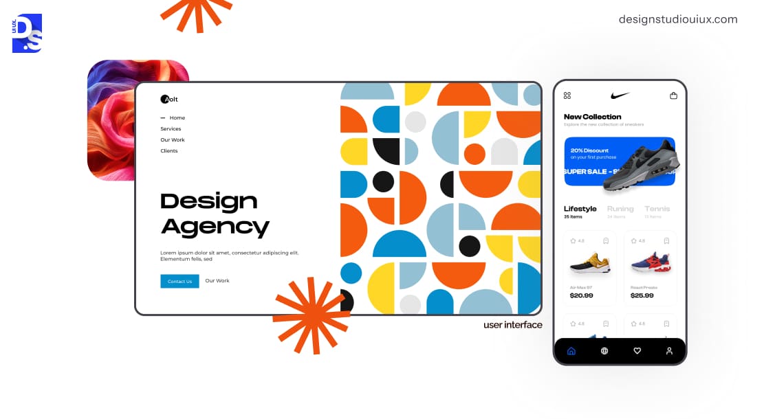
UI design is the craft of designing a product’s visual and interactive elements – layouts, buttons, icons, color schemes, and animations. It focuses on the tangible elements users see and touch when interacting with the product.
UI designers prioritize things like giving the interface a clear visual hierarchy, using the right design elements consistently across the interface, and making each interactive element on the interface responsive to user actions.
Consider a music streaming app. UI designers dictate how all the play buttons look, where they are placed, and how they respond to taps. They may infuse trends like dark mode UI/UX design into the app’s interface to make it easy on the eyes and help users enjoy music longer, especially in low light.
Refining these efforts over time through testing ultimately makes all the interactions users have with the product at a surface level feel instinctive and enjoyable.
What are the Key Differences Between UI & UX Design?
UI and UX design address different layers of the same product. UX defines user journey, how the product functions, in what order and why. UI defines the visual elements and focuses how every screen, button and element looks.
In short: UX design determines how a product works and how users move through it, while UI design determines how the product looks and feels at every touchpoint.
While UX designers are focused on the whole user journey, UI designers solely focus on the surface and interactive layers of the product. Here’s a chart comparing UI and UX design and illustrating their distinct yet complementary roles:
| Aspect | UI Design | UX Design |
| Core Focus | Focuses on visual and interactive elements (buttons, icons, color schemes, layouts) | Focuses on the entire user journey, ensuring intuitive problem-solving and emotional satisfaction |
| Design Goals | Make the product’s surface and interactive layers appealing to target users | Make the overall experience of using the product pleasant, from start to finish |
| Tools | Uses tools like Figma, Sketch, and Adobe XD | UX audit tools, wireframing software, prototyping tools, etc. |
| Skill Sets | Visual design principlesColor theoryTypographyAnimation | Analytical skills for UX researchData analysisJourney mappingAgile project management |
| Temporal Scope | Addresses momentary interactions (like button clicks and responses) | Encompasses the entire user lifecycle (initial discovery to ongoing usage) |
| Measurement Criteria | Evaluated by engagement metrics (click-through rates, time on elements) | Measured by task success rates, error reduction, and overall user satisfaction |
| Problem-Solving Approach | Focuses on specific interaction challenges (such as button visibility, visual hierarchy) | Identifies systemic issues in the user journey hindering satisfaction or task completion |
| Scale of Impact | Operates at the component level, affecting individual screens or elements | Shapes product strategy and business outcomes through holistic interaction |
| User Involvement | Involves A/B testing and feedback on visual preferences | Engages users via interviews and usability tests to uncover needs and pain points |
| Evolution Pace | Evolves with trends (like dark mode, glassmorphism) | Remains stable, focusing on timeless usability and UX principles |
Why is UI/UX Design Important for Businesses in 2026?
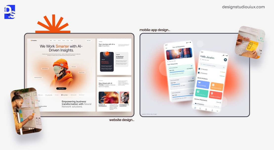
In 2026, UI/UX design is important for brands as it creates smart browsing journeys that help users navigate the screen smoothly and complete their actions. It designs intuitive user experiences that drive retention, increase conversion, and builds brand trust, thereby reducing rework costs.
According to research, smooth personalized user journeys help manage acquisition costs and increase sales by around 400%. Startups, in particular, lean on UI/UX design to level the playing field against established giants.
It is no coincidence that Canva,Slack, andNotion, which have built their brands around offering intuitive interfaces have gained huge success. A stellar design can transform a fledgling idea into a market contender overnight, while a clunky experience can sink even the most brilliant concept.
Here are the main reasons why high-quality UI/UX design is a must-have for any business that has a user-facing digital product:
| Reason | What It Protects | What It Drives |
| First Impressions (13ms Rule) | Instant credibility and trust | User stays instead of bouncing immediately |
| Retention | Subscription revenue and LTV | Repeat engagement through gamified design |
| Conversions | Revenue from existing traffic | Lower CAC by converting more visitors to customers |
| Churn Mitigation | Existing user base | Longer subscription durations |
| Cost Efficiency | Design and development budgets | Faster, cheaper iteration through early testing |
| Brand Equity | Brand credibility | User loyalty through consistent visual identity |
| Accessibility | Legal compliance and inclusivity | Broader market reach |
| Competitive Moats | Market position | Proprietary interaction models that competitors cannot easily copy |
| Future-Proofing | Long-term product relevance | Adaptability to emerging tech (voice, AR, AI) |
First Impressions: The 13 Milliseconds Rule
Human brains process visual information in 13 milliseconds. A cluttered interface, inconsistent typography, or poorly spaced elements can trigger immediate distrust.
Research by the Nielsen Norman Group reveals that 94% of first impressions are design-related, with users associating polished interfaces with credibility.
Fintech app Revolut dominates market share not because it offers unique banking features, but because of its clean dashboard ui design and frictionless onboarding, signaling security and professionalism.al security and professionalism.
Boosting Retention: The Silent Revenue Engine
User retention is the lifeblood of subscription-based digital products.
Apps like Duolingo achieve 55%+ monthly retention through gamified UI/UX design – streaks, rewards, and micro-interactions – that tap into dopamine-driven behavior.
Conversely, platforms with confusing navigation, slow load times, or other UI/UX design mistakes issues always lose customers. A 2024 Baymard Institute study found that 70% of eCommerce carts are abandoned due to poor checkout UX.
Boosting Conversions: The Direct Revenue Engine
Every unnecessary click or form field erodes user trust, which in turn erodes a digital product’s ability to ‘convert’ users into paying customers. UI/UX designers specialize in checking the erosion and ‘converting’ users.
Using heatmaps to improve UX is one of the first things these professionals do when they start working on a product. Tools like Hotjar Heatmaps instantly expose all friction points in user journeys. Making data-driven UX design iterations with this info can instantly boost a product’s conversion potential.
Churn Mitigation
Users rarely complain before leaving – they simply vanish. UI/UX designers use tools like session replays and heatmaps to prevent user attrition by analyzing behavioral patterns.
Using the best UX audit tools, they identify friction points – such as rage clicks or hesitation – that signal confusion or frustration. By streamlining workflows, clarifying navigation, and refining ambiguous features (like permission settings), designers reduce abandonment.
Their focus is on creating intuitive paths that align with user goals, ensuring seamless interactions that retain users by addressing pain points before they escalate into silent exits.
Cost Efficiency
Fixing a UX issue of the digital product in a prototype stage is cheaper than making changes after final launch. This is why investing in good UI/UX design from the start makes perfect financial sense.
UI/UX designers check their ideas early to avoid expensive changes later. They test with users while still making early versions (prototypes), using methods like Design Sprints. This helps them find problems before building the real thing. Doing this saves time and money because the design works better for users from the start.
Techniques like using a low fidelity wireframe early on and a high-fidelity wireframe later on in the design process allow teams to validate their design concepts resource-efficiently. It allows them to align their designs’ core functionalities with user expectations while minimizing budget overruns.
Brand Equity: Design as a Trust Signal
Every interaction a customer has with your interface directly affects how they view your business. Clear, consistent design choices remove confusion and this builds long term trust and brand credibility.
UI/UX designers craft cohesive visual systems that reflect brand integrity.
Consistent typography, color schemes, and iconography signal professionalism, while misaligned elements erode credibility. Designers enforce style guides to ensure uniformity across touchpoints, building trust through predictable, polished interactions.
This consistency reinforces brand identity, fostering user confidence and loyalty by making products feel reliable and intentional.
Accessibility
Inaccessible designs can cause lost revenue for your business. Over 1 billion people live with some sort of disabilities, and this makes up a huge market you need to design for.
UI/UX designers embed inclusivity into core workflows, adhering to standards like WCAG.
They optimize contrast ratios, keyboard navigation, and screen-reader compatibility to serve users with disabilities. Beyond compliance, accessible design broadens market reach and mitigates legal risks.
Designers advocate for alt-text, captions, and scalable UI components, ensuring products are usable by all demographics.
Competitive Moats: UX as Intellectual Property
A great user workflow or interaction model is not just about good UX, it creates a strong business moat. When people get used to the interaction patterns of your app, moving to a rival takes too much mental effort.
UI/UX designers innovate unique interaction models that differentiate products.
By patenting novel features, like gesture-based navigation or dynamic feedback systems, they create defensible market advantages.
These innovations enhance usability while establishing brand identity, making replication costly for competitors and solidifying market leadership.
Future-Proofing
A digital product with a rigid design system will break with new tech. UI/UX designers build flexible systems that adapt to emerging technologies.
They anticipate trends like voice interface UI design, AR integrations, or the ever-expanding role of AI in UX design and then adjust their work accordingly.
By prioritizing modular design and scalable frameworks, they gradually future-proof the products they work on. Their clients can then seamlessly adopt new interaction paradigms without disrupting their brands’ core user experiences.
How To Measure ROI of UI/UX Design?
You can calculate the ROI of UI/UX design as:
ROI = [(Increase in Revenue + Cost Savings) − Total Design Investment] / Total Design Investment × 100.
Here, you have to consider three things – higher conversions, lower support costs, and better user retention. Data suggests well designed interfaces can
- Improve conversion by 200-400%.
- Save around $10 in coding and $100 after launch if you spend $1 on UX .
Also, better conversion by just 1% can yield massive revenue growth.
Take a look at the specific, measurable returns that well-designed products consistently deliver:
| Metric | Documented Impact | Source Context |
| Conversion rate | Good UX can improve conversion rates by up to 200% | PwC Experience Report: 73% of consumers say experience drives purchase decisions |
| Cart abandonment | 70% of eCommerce carts are abandoned due to poor checkout UX | Baymard Institute 2024 |
| First impression trust | 94% of first impressions are design-related | Nielsen Norman Group |
| Customer retention | Apps with gamified UI/UX like Duolingo achieve 55%+ monthly retention | Industry benchmarks |
| Cost of fixing design errors | Design flaws cost 10-100x more to fix post-development than at the design stage | Industry rule of thumb across product teams |
| Organic traffic | Professional UX redesigns improve business outcomes including organic traffic by up to 83% | NNG UX Metrics and ROI research |
What are the Core Principles of UI/UX Design?
UI/UX design principles are the guidelines that keep design choices mainly focused on how users think and what businesses need. This does not consider personal design style or any mere trends. Take a look at the 16 principles to understand how the product works (UX concepts) and looks (UI concepts). Also, look at the shared concepts for both sides.
Let us go through UX and UI design principles in detail:
UX Design Principles
UX design principles are anchored in human psychology and behavioral patterns. These principles guide UX designers in creating products that users feel rather than just use.
1. User-Centricity
UX design begins by prioritizing user needs over assumptions.
Do not mistake this for blindly implementing user requests. Good UX designers do not interpret user-proposed solutions as literal solutions but, rather, as clues to a problem to be solved.
They integrate users early in design to help understand the problem, but do not let them direct or unduly influence the process.
This involves studying real-world user behaviors through contextual observation, empathy mapping, and a variety of other usability testing methods in UX to uncover unarticulated or poorly articulated pain points.
In this sense, UX design is like detective work: designers observe what they actually do through their scrolling patterns. That’s why the importance of UX research can never be downplayed.
2. Visual Hierarchy
According to this principle, designers should guide user attention through deliberate design choices. Working on size, contrast, and spacing ensures users focus on critical elements first. Strategic emphasis on key actions (like primary buttons) reduces cognitive strain and accelerates decision-making.
For example, putting controls and information into logical categories and then hiding them within a parent control, such as a software menu, is a principled UX design choice. The category names remain visible, but the controls and information remain concealed until the parent control is activated
3. Accessibility
The principle of accessibility asserts that designs should be usable by people of diverse abilities, without modification. There are four characteristics of accessible designs:
- Perceptibility: Achieved when everyone can perceive the design, regardless of sensory abilities.
- Operability: Achieved when everyone can use the design, regardless of physical abilities.
- Simplicity: Achieved when everyone can easily learn and understand the design, regardless of experience, literacy, or concentration level.
- Forgiveness: Achieved when designs minimize the occurrence and consequences of errors.
UX designers must always consider accessibility in design from the outset, not as an afterthought. This principle is one of the most essential eCommerce UX best practices because it ensures everyone can easily use and shop on an eCommerce website. This leads to more sales, and in turn, more revenue.
4. Error Prevention & Recovery
Human errors are inevitable, so UX designers must plan for them. They must train on error recovery and troubleshooting, and always incorporate the principle of forgiveness into designs to reduce the frequency and severity of errors when they occur.
Preventing or mitigating different kinds of errors requires different kinds of UX design strategies for prevention or mitigation.
Slips are errors of execution and therefore involve strategies that center around constraining or confirming actions. Lapses are errors of attention and therefore involve strategies that center around grabbing, focusing, and holding attention.
5. Peak-End Rule
The peak-end rule is a cognitive bias that influences how people remember past experiences. The peak signifies the moment that elicits the strongest emotional response in an experience, whether positive or negative, and the end signifies the conclusion of that experience.
According to this principle, users judge experiences by emotional highs and final interactions. So, designers must pack user journeys with multiple peaks and then end on a high note.
Following this principle is essential in landing page UX design. It creates a strong first impression and a memorable ending, which helps users feel good and remember the experience.
6. Mental Model Alignment
Mental models are internal representations of systems and environments derived from experience. People understand and interact with systems and environments by comparing the outcomes of their mental models with the real-world systems and environments.
When the outcomes correspond, a mental model is accurate and complete. When the outcomes do not correspond, the mental model is inaccurate or incomplete.
Interfaces must mirror users’ pre-existing expectations. Using familiar UX design patterns (such as drop-down menus, trash can for deletion) reduces learning curves and prevents cognitive dissonance.
7. Narrative-Driven Design
Using storytelling in UX design is one of the most compelling methods for communicating information. Structuring flows as cohesive stories guides users intuitively.
By framing tasks as journeys with clear progression, designers transform fragmented actions into meaningful experiences.
UI Design Principles
UI design principles are rooted in psychology and ergonomic efficiency. They help create interfaces that feel intuitive, inclusive, and purposeful:
8. Consistency
Usability and learnability improve when similar interface elements have similar meanings and functions. Uniformity in buttons, icons, and interactions builds trust. Predictable patterns reduce cognitive load, allowing users to navigate instinctively across features.
As per this principle, UI designers must be consistent by default. Unless there is a compelling reason to be different, be consistent aesthetically, functionally, internally, and externally
9. Responsive Feedback
Every user action demands a response. Feedback is the foundation for all usability and learning. UI designers must orient users, give them targeted guidance when needed, then repeat.
The rule should be minimum viable feedback, visual or auditory cues (like button states, loading indicators, etc.) to confirm interactions, delivered quickly and consistently to prevent uncertainty and reinforce users’ control over the interface.
10. Aesthetic-Usability Synergy
Aesthetic interfaces are often subjectively rated as easier to use, even when no usability advantage can be objectively measured. This aesthetic-usability effect is consistent with research on positive first impressions. By balancing beauty with clarity, clean layouts, and harmonious typography, designers can enhance the perceived ease-of-use of the interfaces.
Ever wonder what is the reason behind the constant flow of neumorphism, glassmorphism, and other UI design trends? It is because users’ aesthetic preferences evolve every few years and UI designers all rush to keep up. While the neumorphism UI trend makes apps feel more natural and easy to use by adding soft, touch-like visuals, the glassmorphism UI trend makes the interface look clean and modern, helping users focus better on important content.
11. Adaptive Color Schemes
According to this principle, color can make designs more visually interesting and aesthetic and can reinforce the organization and meaning of elements in a design. If applied improperly, however, colors can seriously harm both form and function. To avoid the latter, UI designers must:
- In interaction contexts, limit the palette to what the eye can process at one glance (no more than 5 distinct colors).
- Create aesthetic color combinations by using adjacent or opposing colors on the color wheel.
- Favor warmer colors for foreground elements and cooler colors for background.
- Use saturated colors (pure hues) to attract attention.
- Learn about dark mode UI/UX design to optimize readability across environments while reducing eye strain in different contexts (like low-light usage).
12. Tactile Realism
UI designers must leverage subtle visual cues (soft shadows, gentle gradients, and dimensional depth) to mimic real-world physics. This creates subconscious affordances, guiding users to interactable elements (like buttons that appear “press-able”).
However, overemphasis risks visual noise. The goal is to evoke familiarity without sacrificing digital simplicity, ensuring interactions feel grounded yet uncluttered.
Shared Principles
These principles bridge both disciplines and address the symbiotic relationship between visual and interactive clarity and experiential flow.
13. Progressive Disclosure
Complex systems are introduced in stages, aligning with user readiness.
Core functions remain immediately accessible, while advanced options emerge contextually – only when triggered by user actions or expertise. This minimizes cognitive overload for beginners while empowering power users, balancing simplicity with depth.
14. Performance Optimization
Speed is psychological comfort. Optimizing asset loading, code efficiency, and interaction latency ensures interfaces respond faster than human perception thresholds (~100ms). This is where quick loading website design plays a key role in preserving user flow and reducing drop-offs.
Beyond technical metrics, this preserves user flow – delays disrupt concentration, erode trust, and fracture the illusion of effortlessness central to great design.
15. Frictionless Conversion Pathways
Critical user goals (purchases, sign-ups) demand surgical simplicity. This involves distilling multi-step processes into singular, linear flows with clear milestones.
Eliminating redundant inputs, auto-filling predictable data, and providing real-time validation reduces both mental effort and physical clicks. These efforts transform barriers into transitions.
16. Fitts’ Law
Fitts’ law is one of the many laws of UX that also applies to UI design. It proposes that the time required to touch a target is a function of the target size and the distance to the target.
Also, the faster the required movement and the smaller the target, the greater the error rate due to a speed-accuracy tradeoff. Both UI and UX designers must consider Fitts’ law when designing systems that involve pointing.
Make sure that pointing targets are near or large, particularly when rapid movements are required and accuracy is important. Also, make targets more distant and smaller when they should not be frequently used or when they cause problems if accidentally activated.
What is the UI/UX Design Process? A Step-by-Step Breakdown
The UI/UX design process follows a clear sequence of research, validation, and iteration to make practical design choices. Skipping any of the steps does not speed up your work, but can lead to costly errors later on.
Crafting exceptional digital experiences requires a structured, collaborative approach that balances user needs with business goals. Here’s the UI/UX design process in 10 actionable steps:
1. Discovery & Stakeholder Alignment
The journey begins by aligning product managers, developers, and all designers working on the product with the project’s objectives, scope, and constraints. Here, UX and UI designers:
- Define all measurable business goals (like improving upon an existing product, 10k signups by first month, etc.).
- Establishing core brand guidelines.
- Define all key user objectives.
- Align initial design concepts with the brand’s vision.
By the end of this step, everyone on the team shares a unified vision of what the product will be.
2. UX Research
Next, both UI and UX designers immerse themselves in UX research by conducting:
- User Interviews
- Contextual Inquiries
- Card Sorting
- Tree Testing
- Surveys
- A/B Testing
- Diary Studies
- Eye Tracking
- Emotional Journey Mapping
They create personas, empathy maps to visualize their target users’ needs, pain points, and emotional triggers related to the product.
3. Information Architecture Design
Information architecture in UX design is all about crafting a clear and intuitive framework for content, ensuring users can navigate a product with ease and confidence.
In this step, UX designers lay the groundwork for a user-friendly experience by building sitemaps and user flows, organizing pages and interactions logically.
Up next, content. Creating a robust content strategy in UX design means aligning all messaging in the product with the user and business goals. This strategy shapes how all the text, visuals, and multimedia in the product ultimately come together to support the user’s journey.
UI designers translate this structure into visual layouts. They place the interactive elements in the sections of the layouts where users instinctively look.
By now, the core UI and UX structures of the product start taking shape.
4. Wireframing in UX Design
Wireframing in UX design involves creating low, mid, or high-fidelity blueprints that outline the product’s basic layouts and core functionalities. It gives designers a chance to simulate what it will be like to use the product once it is designed. It enables them to share and test the approximations of the experience they’re envisioning.
With each iteration of these blueprints, UX designers refine the design’s user flow while UI designers test out element placement (like headers, CTAs, etc.) tactics.
For inspiration, explore some real-world wireframing examples and see how they help fast-track design decisions.
5. Prototyping in UX Design
Just like with wireframes, using a prototype in UX design lets the team simulate user journeys, brainstorm ideas, test key functionalities, and identify potential friction points long before any expensive and ‘real’ design work begins.
The difference is that prototypes tend to be more visually detailed and interactive than wireframes. By this step, UI designers add brand-aligned visuals to the prototypes to see if the UI’s aesthetics complement its usability.
UX designers also add more nuanced user flows to prototypes and then send them away for testing. Barring a few subtle details, the final prototypes resemble the final product almost entirely.
6. Visual Design & UI Development
Next, UI designers transform wireframes into pixel-perfect interfaces, applying brand colors, typography, and responsive layouts. UX designers validate that visual choices enhance – not hinder – usability. This stage merges artistry with logic, ensuring the product is both visually compelling and intuitively functional.
7. Usability Testing & Iteration
This phase transforms theoretical designs into validated experiences through real-world scrutiny. UX designers orchestrate moderated testing sessions, observing how users interact with prototypes to identify friction points – hesitations, mis-clicks, or confusion.
They complement these insights with A/B tests and audits – comparing design variants to quantify which layouts or flows drive better engagement.
Feedback loops become critical here: UI designers iterate on visual elements – adjusting button contrast, refining micro-interactions, or simplifying icons – to align aesthetics with usability.
This collaborative refinement cycle continues until the design achieves equilibrium, where every interaction feels instinctive and every visual choice reinforces clarity.
8. Development Handoff
With designs polished, the focus shifts to bridging the design-development gap. UX teams compile comprehensive documentation – user flow diagrams, interaction logic, and edge-case scenarios – to articulate how the product behaves.
UI designers, meanwhile, deliver pixel-perfect assets: icon libraries, animation specs, and responsive breakpoints, all anchored to a cohesive style guide.
Tools like Figma Dev Mode or Zeplin streamline this handoff, ensuring developers have access to exact spacing, color codes, and component states. Minimizing ambiguities that could dilute the user experience during the build-out is the underlying goal of this stage.
9. Launch & Monitoring
The product’s release marks the beginning of its lifecycle, not the end. Teams track KPIs like session duration, conversion funnels, and bounce rates to gauge initial success.
UX designers dive into qualitative feedback (like user surveys, session recordings) to understand emotional responses and unmet needs.
UI designers monitor visual engagement metrics, such as heatmaps showing where users linger or ignore. This real-time monitoring creates a feedback reservoir for later on.
10. Post-Launch Optimization
Great product designs keep evolving. UX designers keep analyzing behavioral patterns – drop-off points in workflows, underused features – to streamline journeys. For example, when working on a website, they might conduct a thorough UX website audit every few months.
Similarly, UI designers keep introducing subtle features to the UI based on feedback.
Constantly making changes to a product’s design as per feedback is key in the methodology of Agile UX, i.e., the methodology that most modern UI/UX design teams use.
To learn more about the design process in an in-depth manner, read our comprehensive guide on the steps of UI/UX design process in details.
What are the Top UI/UX Design Trends in 2026?
Major UI/UX design trends in 2026 include AI personalization, microinteractions, extended reality, voice-first interfaces, sustainable design with dark mode, and a growing demand for inclusivity.
Let’s understand them here:
- Leading the charge is hyper-personalization, where AI tools tailor interfaces to individual habits, adjusting layouts, colors, and content dynamically.
- Meanwhile, Extended Reality (XR) is dissolving the line between physical and digital, enabling gesture-controlled interfaces for virtual showrooms or AR-driven educational tools.
- Voice-powered UIs can now handle nuanced workflows like scheduling payments or detecting users’ stress levels to adjust their tone.
- Sustainability is getting baked into UI/UX designs with features like dark mode defaults and auto asset optimization that slash energy use.
- Finally, AI-driven micro-interactions are injecting delight into mundane tasks, like animated confetti after a purchase.
UI/UX design is becoming a technology-fueled dialogue between user intent and algorithmic empathy. This dialogue is getting more sci-fi and more exciting every year.
What Are the Best Tools and Resources for UI/UX Design?
The best tools for UI/UX design are Figma for collaborative interface design, Framer for interactive prototyping, and Laws of UX for fundamental design principles. All these resources make sure your digital products are built on proven human psychology and seamless team workflows.
Learn about the fundamentals of this field by reading high-authority blogs like this guide on navigation UX design. Study the designs of your favorite apps. Look up highly-rated UI/UX design website examples.
1. Start mastering the dual discipline of UI/UX design by using resources like Coursera’s UI/UX Specialization course, Udacity’s UX Nanodegree, or The Futur channel on YouTube.
2. Learn about the fundamentals of this field by reading high-authority blogs like this guide on navigation UX design.
3. Study the designs of your favorite apps. Look up highly-rated UI/UX design website examples.
Start experimenting with the free versions of the following tools:
UX Research & Strategy
- Maze for AI-charged usability tests
- Flow-Mapp to map slick user journeys
- Hotjar for live user behavior intel
UI Design & Prototyping
- Figma for team design wizardry
- Sketch for macOS die-hards
- ProtoPie for code-free, next-level prototypes
- Zeplin for UX design
- Framer for prototypes that code themselves
What Are the Most Common UI/UX Design Mistakes to Avoid?
Common UI/UX mistakes are ignoring user research and wireframes, and picking looks of the product over its usability. The list also includes ignoring mobile first design, skipping post-launch testing, and treating accessibility as a secondary option.
1. Ignoring user research: Teams often build what they personally like instead of what users find easy to use. This is exactly why user research exists.
2. Skipping wireframes: Going straight from brief to high-fidelity design can impact the whole structure of the design process. Here,structural issues might get locked in before anyone tests them.
Fix usability issues at the wireframing stage as it is cheaper compared to fixing them after launch.
3. Looks over usability: A good-looking interface that confuses people has still failed. Designers must prioritize usability over looks of the product.
4. Ignoring mobile: Designing for desktop first and adjusting for mobile later can result in a compressed secondary mobile experience. Mobile-first design is now the standard for every product.
5. No testing after launch: Assuming the design is “done” at launch is risky. Real users often hit friction points that internal testing never caught. Build a feedback loop to catch issues early.
6. Accessibility added too late: Adding accessibility features in the later stage of the design process is expensive and less effective. It’s both a legal requirement and a commercial edge.
7. No shared design system: Building components one-off instead of from a system creates visual inconsistency that can erode brand trust over time.
How to Choose the Right UI/UX Design Agency?
To choose the ideal UI/UX design firm for your brand, first evaluate their user research and design execution skills. Try to understand how the services are aligned with your business goals. The best approach involves setting clear performance metrics and checking their case studies for better understanding.
For professional design assistance, find firms that specialize in UX design for enterprise. Scrutinize their portfolio, look for their past work in your industry (or with similar products), and ask for free consultations.
In the consultations, share your needs and ask for a free audit of your current digital presence. Top firms instantly spot issues like fractured user flows and start proposing solutions.
Challenge shortlisted teams to design a low-fi wireframe of your proposed product. Give the winner the contract.
FAQs
What is UI/UX design?
UI/UX design is the process that makes websites and applications effortless for users to navigate. UI defines the elements that make a product look good, while UX focuses on how it works and how people move through it.
What’s the difference between UI and UX design?
UX defines the user journey — how a product functions and in what order. UI defines the visual elements — how every screen, button, and element looks. UX designers focus on the whole journey; UI designers focus on the surface and interactive layers.
How do you measure the ROI of UI/UX design?
ROI = [(Increase in Revenue + Cost Savings) − Total Design Investment] / Total Design Investment × 100. Well-designed interfaces can improve conversion by 200–400% and save roughly $10 in coding and $100 post-launch for every $1 spent on UX upfront.
What are the most common UI/UX design mistakes?
The most common mistakes are skipping user research, jumping straight to high-fidelity design without wireframes, prioritizing looks over usability, designing desktop-first instead of mobile-first, skipping post-launch testing, and treating accessibility as an afterthought.
Conclusion
Great products happen when both UX and UI concepts come together. UX creates the foundation of how a product works and UI shapes how it looks/feels. Also, sticking to the core design principles, following the right process, using the right tools, and avoiding common mistakes is what turns that collaboration into a product people actually enjoy using.
Now, Whether you are modernizing a legacy website or crafting a consumer app from scratch, at Design Studio UI/UX, we are equipped to handle all types of UI/UX design projects – and all of our projects come with free consultations.
Contact us now to learn how our pro-grade UI/UX aid can help you deliver digital experiences that do not just meet your users’ expectations – they redefine them.


