


14 SaaS Design Trends for 2026: Cut Churn & Drive Growth



Quick Summary
SaaS design trends highlight the rise of AI-driven personalization, data-focused interfaces, and accessible, human centered design. These trends blend technology with storytelling to better adapt to user needs, resulting in modern, efficient, and intuitive SaaS experiences.
| A note from our studio : I’ve been auditing and redesigning SaaS products for over a decade. What strikes me most about 2026 is that the trends aren’t new, they’re corrections. Teams over-designed their way into complexity, and now the smartest products are stripping back to clarity. Every trend in this list is something we’ve navigated with real clients. I’ll call out where we’ve seen it work and where teams get it wrong. – Sneh Sagar, Co-Founder, Design Studio UI/UX |
The SaaS industry is on a tear. Data suggests it is exploding toward $374 billion by 2026. There are many innovative SaaS design trends that are fueling this bombastic growth.
Staying on top of these trends is vital for firms that want to survive and scale in this space, especially when implementing SaaS landing page design best practices that convert visitors into loyal users.
Why? Because a CFO evaluating an accounting SaaS tool is not just buying it for its features. They are buying a user experience (UX) that must amplify their team’s workflow, not over-complicate routine tasks.
Tools that abide by the best practices for SaaS UX and follow the latest trends bridge this dreadful gap between raw functionality and human behavior. They transform complex systems into intuitive extensions of daily work.
What Are the Top 14 SaaS Design Trends Shaping 2026?
The top SaaS design trends in 2026 are AI personalization trends, human-centric design, micro interactions, dark mode, mobile-first design, accessibility, and gamification.
They also include no-code/low-code UI accommodations, 3D visuals and interactive demos, voice UI and chatbot integration, minimalism, and data visualization.
You can take a look at this table to understand how modern SaaS design is better than the traditional design style-
| Design Area | Old SaaS Style | 2026 Modern SaaS |
| Personalization | One-size-fits-all interface | Includes smart UI features to accommodate every user needs |
| Emotional Design | Cold tone – no emotional connection | Human centric design that prioritize places real people’s pain points |
| Feedback | Limited response – Only hover or basic alerts | Instant, clear action confirmations due to clear microinteractions |
| Display Modes | No theme flexibility – mostly Only light UI available | Dark mode plus custom themes- Users can control theme and colors |
| Mobile UX | Limited features on mobile | Designed mobile-first, smooth navigation |
| User Engagement | Users explore on their own | Guided interactive onboarding, progress tracking |
| Customization | Changes need developers | Flexible UI. Drag-drop no-code customization tools |
| Data Handling | Static charts and exports. Requires manual analysis | Interactive real-time data insights with live dashboards |
| Accessibility | Basic compliance mindset | Inclusive accessibility design from the beginning |
| Layout Style | Heavy, complex interfaces | Simple, clean layout, easy to scan |
| Navigation & Search | Users hunt through nested menus to find features | Command palette (Cmd+K) lets users search and act on anything instantly |
| Design Consistency | One-off screens built individually, drifting apart over time | Modular design systems with reusable components that update everywhere at once |
SaaS design trends evolve fast, but trends only create results when they’re applied within a structured product design framework.
Before you adopt any of these patterns, it’s worth understanding how they sit within the full SaaS UX workflow.
Our SaaS UX design ultimate guide covers every phase from onboarding to dashboard design to retention flows in one place.
Let’s dive into the 14 most important SaaS design trends of 2026.
1. AI-Driven Personalization in SaaS UX Design
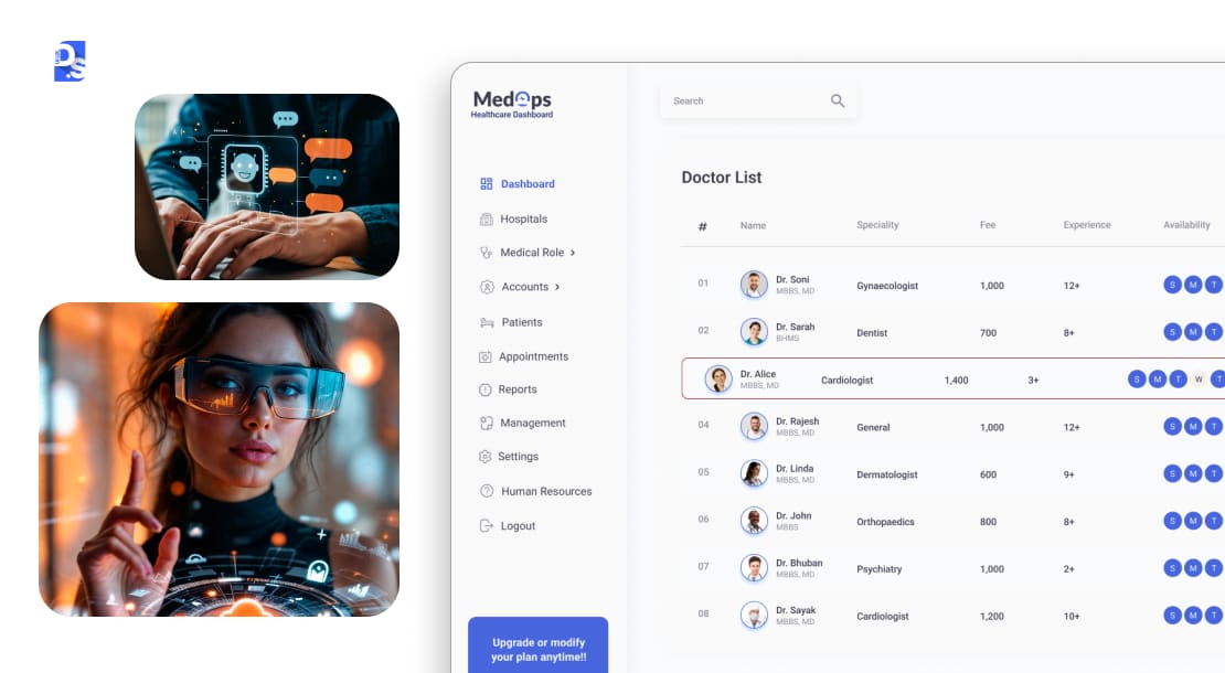
In 2026, SaaS tools use AI to change the dashboard and features based on users behaviour, role and site usuage.
This concept is now less a trend and more the new standard that addresses users needs, just like apps like Netflix and Spotify does.
Note that apps that do not use AI personalisation features deliver generic user experience. This can directly impact churn rate as users today quickly ditch tools that do not feel built for their specific needs.
This concept kicked off with basic recommendation engines but has rapidly matured into sophisticated systems that predict needs and morph interfaces to fit individual workflows.
Why the surge? Because AI and ML are now core to modern SaaS, automating complexities and dishing out actionable insights.
Their impact on SaaS adoption has been massive.
Key AI personalization features now shaping SaaS UX:
- Personalized, AI-powered dashboards that feel alive with real data are far superior in engaging users to their static predecessors.
- Adaptive SaaS interfaces that respond to users’ unique browsing patterns.
According to Salesforce’s report, more than 70% of users demand customized features. This results in better engagement, up to 40%, particularly in SaaS industry, due to AI personalised interfaces.
Examples of AI-driven personalization in action:
- Salesforce Einstein conjures custom, personalized dashboards based on user role and behavior.
- Microsoft Office 365 automatically highlights features you actually use, over those you never use.
| How we apply it at Design Studio UI/UX: On a recent SaaS project, we restructured the onboarding dashboard to surface different feature sets based on user role – admins saw compliance KPIs first, while operators saw task queues. This single change reduced the average time-to-value from 9 minutes to under 3 minutes. AI personalization doesn’t have to mean ML pipelines from day one — even rule-based role segmentation at the UI layer makes a measurable difference. |
2. Emotional and Human Centric Design
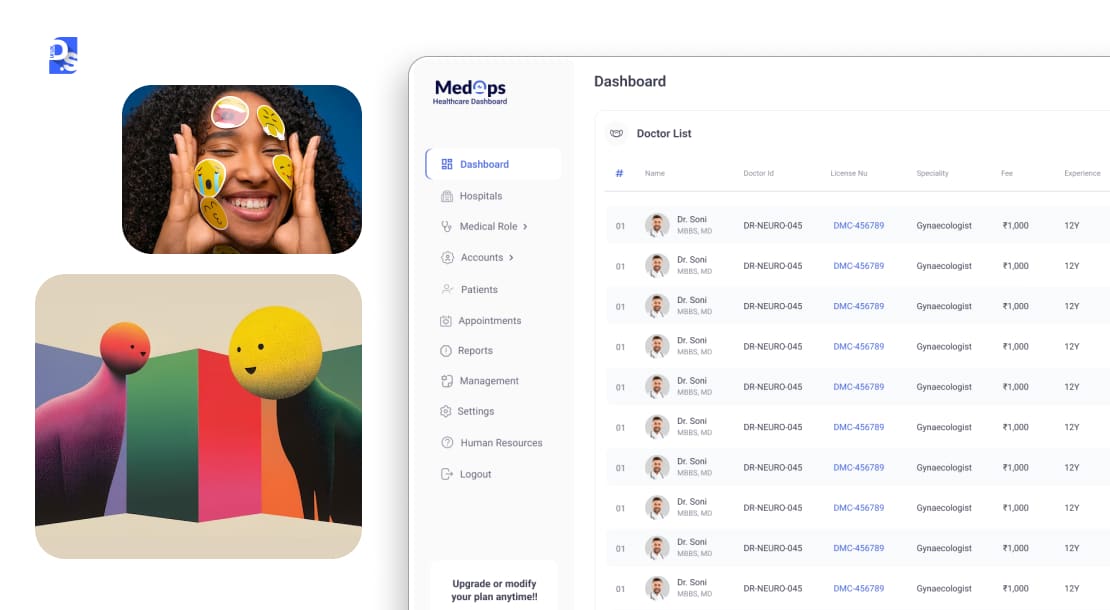
Emotional and human centric design prioritise user emotions and not just their scrolling patterns.
This approach fixes boring softwares and removes mental friction that usually stops people from actually wanting to browse it.
It uses thoughtful microcopy, celebratory moments, and approachable visual language to make users feel encouraged and positive when navigating the SaaS product.
This is one of the most important B2B SaaS trends of our time. Why? Because injecting much-needed warmth into the often-sterile world of business software is very important.
This trend emerged as a pushback against purely utilitarian tools.
Users, accustomed to delightful consumer apps, started asking, “Why can’t my work software feel this good?” So, pioneers like Slack with its playful pings and Asana with its celebratory unicorns showed it was possible.
Since then, this B2B SaaS trend has been booming.
Stakeholders in this industry are finally acknowledging that emotions do indeed dictate their decisions, engagement, and perceived value.
Core aspects of this B2B SaaS design trend are:
- Vibrant illustrations that clarify complex concepts and charm new, less technical users.
- Genuinely inclusive design that welcomes everyone.
- A thoughtful tone of voice in microcopy that speaks like a human.
- A soft UI with inviting curves and colors.
SaaS tools with these UI/UX design features connect on an emotional level.
They do not just get used; they get loved. They also get adopted more frequently because they make tasks less of a chore and more of an experience.
Examples of emotional design done right:
- Mailchimp uses its friendly mascot and encouraging messages to make email marketing feel less daunting.
- Headspace for Work’s design brings a calming, human touch to corporate wellness.
3. Micro Interactions That Reduces SaaS Churn
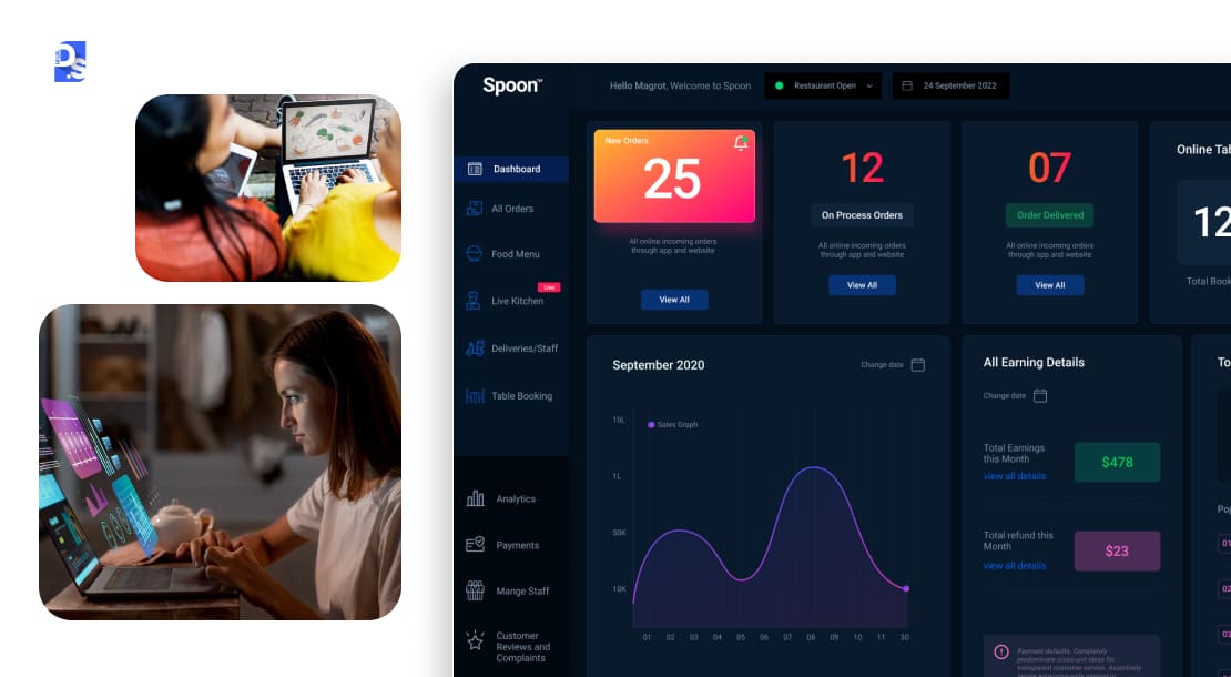
Important UI elements of microinteractions include Feedback loops, animations, button effects, and in-app transitions. These options give users a sense of response and provide feedback for every action.
They tell users exactly what is happening at every step and help them manage their anxiety and build confidence.
Today, microinteractions make SaaS tools feel alive and trustworthy. They are basically-
- Subtle animations that confirm every user action.
- Tactile button effect that makes the ‘click’ feel satisfying.
- Seamless, custom-designed transitions in-between screens that maintain context.
- Purposeful animations that guide users through different stages of the tool, especially during trial periods.
These tiny, almost imperceptible moments of feedback and engagement collectively scream quality and responsiveness. They have always been in SaaS tools, but their early iterations were basic. As the SaaS battleground got crowded, savvy designers realized these details could be powerful differentiators.
So, what started as simple hover states has blossomed into orchestrated ballets of feedback,
Some common examples of microinteractions are-
- Figma nails this with animations that make design tools feel tactile.
- Stripe’s dashboard provides instant, clear feedback on complex financial actions.
- Airtable also uses slick transitions to help users understand data relationships.
4. Dark Mode + Color Flexibility – The SaaS Design Standard
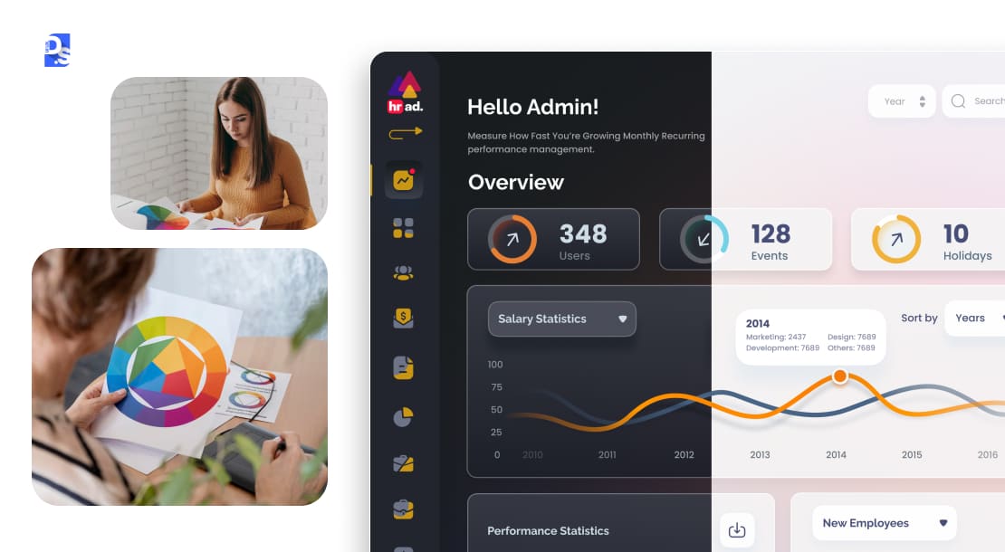
Important features – Accessibility, battery-saving, and user preference control.
This SaaS design trend is a nod to users’ needs for comfort, accessibility, and personalization.
Dark mode’s roots are in dev environments, where coders sought eye relief during marathon sessions.
It went mainstream as OS-level dark modes became standard, and users began expecting this choice everywhere.
Accommodating varied lighting, visual sensitivities, and personal preferences makes SaaS platforms more comfortable and usable for longer stretches.
Dark Mode also saves battery power on OLED/AMOLED screens. More importantly, it gives a clear signal that the SaaS tool respects its users’ well-being and gives them full agency over their visual environment.
This long list of benefits is why there are now countless SaaS design examples of tools adopting Dark Mode.
How we apply it at Design Studio UI/UX:
The mistake most teams make with dark mode is inverting their light theme. That’s not how it works. Dark mode requires a separate elevation model — surfaces need to get lighter as they stack, not darker. In our design system builds, we define a dedicated dark token set from scratch.
It adds about 20% to the design system work but prevents the washed-out, low-contrast dark modes that users turn off within a day.
5. Mobile-First SaaS Design
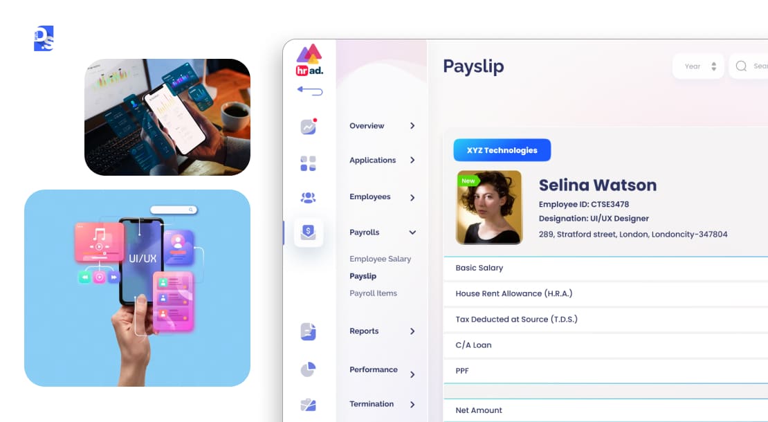
Critical features of mobile first SaaS designs are thumb-friendly UIs, responsive performance, and PWA integration.
Mobile-first design means design for mobile experience first. It ensures the app performs perfectly for mobile users and brings in more traffic.
This trend acknowledges the undeniable truth: the future of SaaS is in mobile. It is now the primary interface for getting work done on SaaS tools.
While mobile-first is not new, its deep integration into complex SaaS tools has taken time. Early SaaS mobile apps were often watered-down afterthoughts.
But as remote and hybrid work became the norm, the demand for full-featured, robust mobile SaaS experiences exploded.
People can now check dashboards, approve requests, review reports, and respond to notifications on their phones.
According to research done on global web traffic, more than 60% traffic comes from mobile devices. So, if your app is not built for mobile first design, you will loose potential users which can impact your brand value.
In 2026, expecting seamless, powerful functionality on your phone is standard. Non-mobile-first SaaS designs do not align with how modern teams operate – distributed, agile, and always on.
So, creating thumb-friendly UIs designed for one-handed use is now vital.
SaaS tools must also offer stellar responsive performance even on flaky connections (including offline capabilities).
Examples of mobile first SaaS designs-
- SaaS tools like Asana now offer near-total feature parity with desktop, using smart UX design to manage their features’ complexity.
- Zendesk also prioritizes time-sensitive customer service tasks on mobile.
6. Gamification Elements
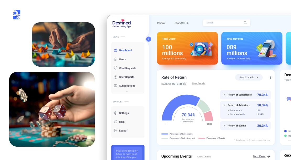
Important gamification elements – Progress bars, reward systems, onboarding games, and badges.
Let us talk about making work feel less like… well, work.
Enter gamification, the art of strategically applying game mechanics to boost engagement, motivate specific behaviors, and make routine tasks more compelling.
It started with somewhat superficial badge systems but has matured into sophisticated psychological motivators tied directly to user success and product goals.
With digital natives, who grew up on interactive incentives, now dominating the workforce, well-implemented gamification is an expectation.
Research suggests companies that use gamification features see 48% better user engagement and help people learn your software 36% faster.
Its impact on adoption is undeniable.
Key gamification elements that drive SaaS adoption:
- Progress visualization (bars, journey maps)
- Meaningful reward systems (badges, unlocking features)
- Engaging onboarding games or challenges
- Recognition mechanics that build status and encourage mastery
- Friendly competition between users within the tool
All of these gamification elements transform user onboarding or routine usage from a slog into an engaging journey.
Common Examples of Gamification:
- Duolingo for Business applies its famed language-learning gamification to corporate training.
- Salesforce has long used leaderboards and badges to motivate sales teams. Their designs are great at tapping into our innate desire for achievement and progress.
7. No-Code/Low-Code UI Accommodations
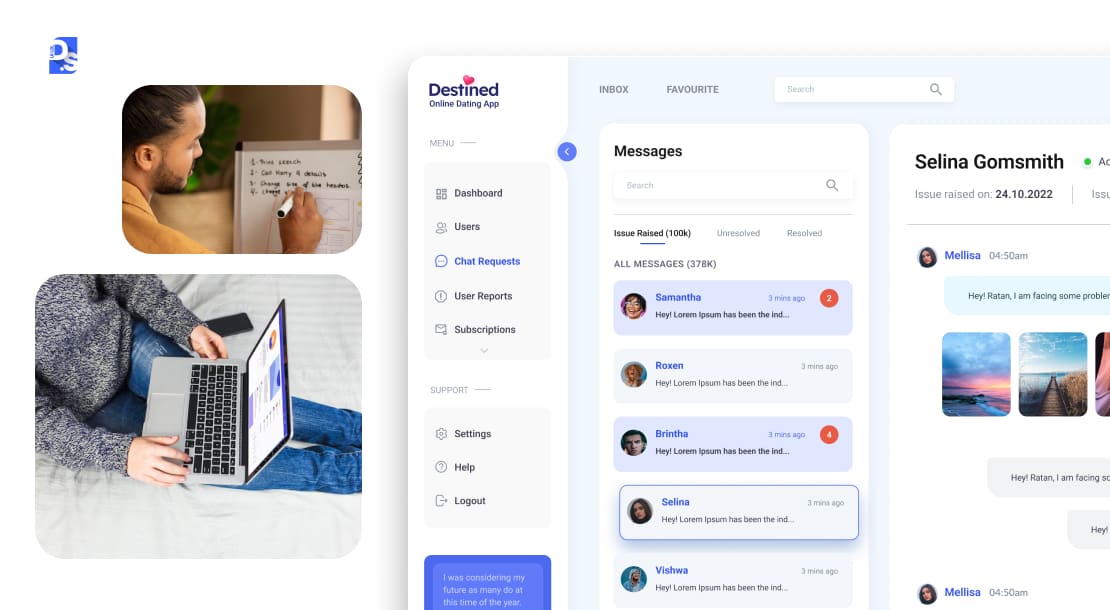
SaaS UIs that accommodate no-code or low-code customization allow users to build their own workflows, automate processes, and modify layouts.
They empower users to tailor their SaaS experiences, even if they don’t have any technical expertise.
This trend arose from the inherent tension between standardized SaaS features and the beautifully unique needs of every business. Today, simple customization options have evolved into powerful visual builders embedded directly within SaaS platforms.
Leading no-code/low-code SaaS platforms:
- Airtable gives users an intuitive, spreadsheet-like UI that lets users construct custom apps.
- Zapier makes complex cross-app automation accessible through visual “if-this-then-that” logic.
They are using this trend to blur the line between using SaaS tools and building with them.
This directly addresses the fear that an off-the-shelf SaaS solution won’t fit specific operational needs. Organizations can now sculpt their SaaS tools to their specific operational demands.
8. 3D Visuals & Interactive Product Demos
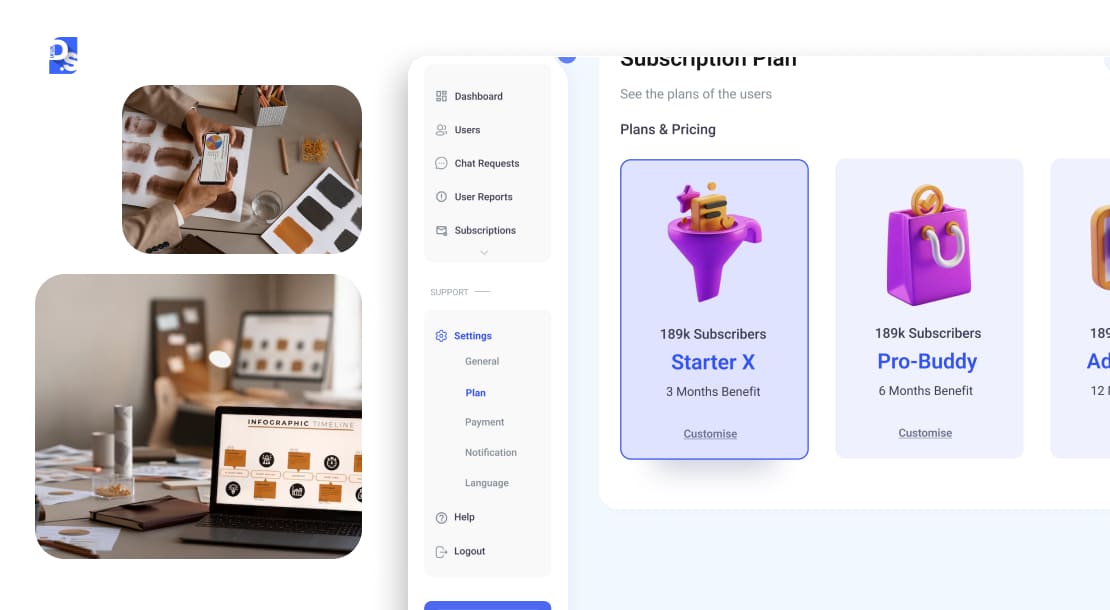
SaaS tools are literally adding a new dimension to their UI/UX designs by integrating 3D visuals.
Feature-rich, 2D interfaces can sometimes struggle to convey spatial relationships or multifaceted functionalities effectively.
Why 3D visuals and interactive demos work better for SaaS UX:
- Interactive 3D models are far better at explaining complex data sets.
- They let users explore product features in an immersive way.
- They engage users more effectively during onboarding.
- Interactive product showcases and explorable UI walkthroughs make SaaS tools’ learning curves more intuitive.
- They add a “wow” factor that captivates new users.
The trend is heating up because of major advancements in web rendering technologies (like WebGL) and a growing demand for more immersive digital experiences.
9. Voice UI and Chatbot Integration
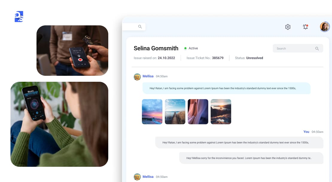
Speaking a command is much easier than navigating multiple menus. That’s why SaaS tools like Salesforce Einstein are offering Voice UIs that offer contextual help and automated responses.
This trend, often called conversational UI, covers both voice commands and chat-based interfaces working together.
It began with consumer voice assistants and simple website chatbots. But it is now maturing into intelligent support systems that are embedded within many new SaaS dashboards.
What voice UI and chatbots enable in SaaS:
- Issuing voice commands to generate reports, query data, or initiate workflows.
- Getting complex support issues resolved by an intelligent chatbot that understands context.
Improvements in Natural Language Processing (NLP) and rising user demand for hands-free operation and instant assistance have made these convenient features a possibility.
10. Accessibility as Core, Not an Afterthought
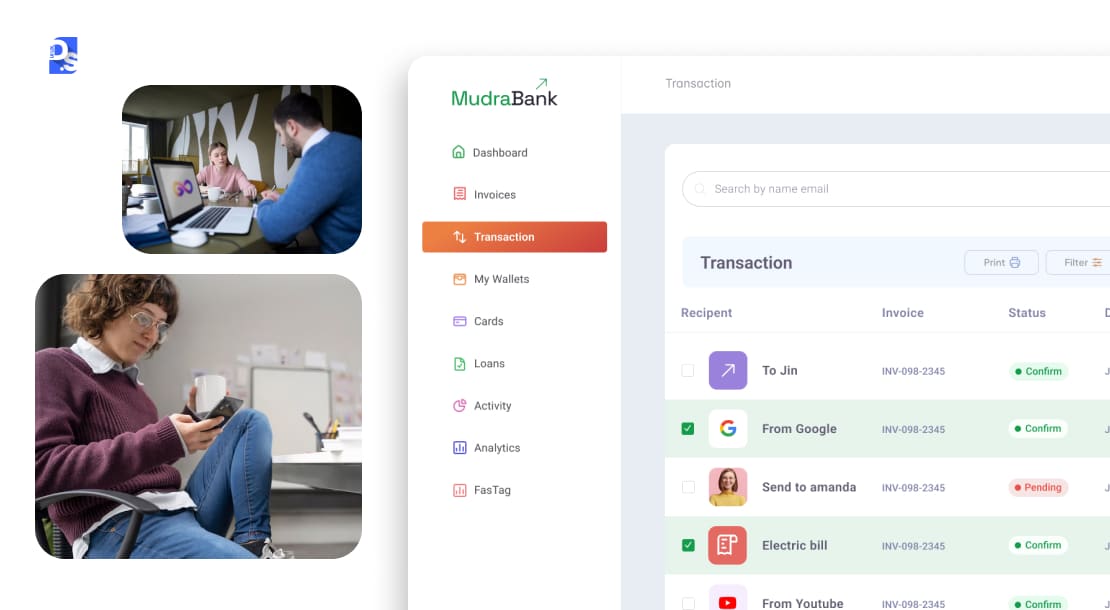
Accessibility is now a requirement due to strict new laws and a massive market opportunity. Interfaces that follow accessibility factors elevate design quality and usability.
They make products easier for all users to navigate, not just with disabilities.
Important accessibility parameters for SaaS design includes WCAG 2.2 compliance, screen-reader-friendly UI, color contrast ratios.
Accessibility (styled as a11y) is no longer a checkbox item. It is one of the most fundamental principles of saas web design.
That’s because ensuring that SaaS products are usable by people with the widest possible range of abilities, including visual, auditory, motor, and cognitive impairments, is not just good ethics.
It is good business.
This trend gained momentum due to increasing legal requirements (like the ADA), a growing ethical awareness, and the realization that accessible design benefits everyone involved.
Today, all leading SaaS tools aim for WCAG (Web Content Accessibility Guidelines) 2.2 compliance.
Data shows 96% of the top one million website homepages still fail WCAG parameters. This means designers have to work on accessibility factors to make the site useful for everyone, especially for people with disabilities.
They all offer screen-reader-friendly UIs. They all meticulously manage their UIs’ color contrast ratios to be visually pleasing.
11. Strategic Minimalism in B2B SaaS Interfaces
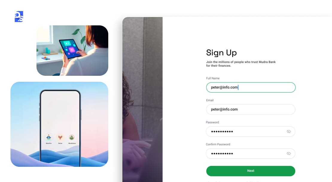
Minimalism is a design philosophy that removes clutter and makes the site interface stand out. It uses simple layouts which reduces cognitive load and helps users complete their tasks quickly. It uses proper spacing and establishes a clear visual hierarchy, making the product feel more reliable.
Important minimalism concepts include –
- strategic use of negative space
- using a limited color palette
- establishing a clear, easy-to-follow visual hierarchy
- prioritizing uncluttered navigation
- elevating the essential design elements and removing everything else.
In a world of feature overload, such minimalist design decisions are very well appreciated in SaaS tools. It makes them appear less intimidating and easier to learn.
Examples of strategic minimalism in SaaS:
- Notion champions clean, spacious UI with a clear hierarchy that cuts cognitive load, while also embracing human-centric elements.
- Modern project management SaaS apps that prioritize content and tasks over Chrome demonstrate this deliberate reduction of visual noise.
This deliberate reduction of visual noise and cognitive load allows users to accomplish their tasks with maximum efficiency and minimal distraction.
12. SaaS Dashboard Data Visualization
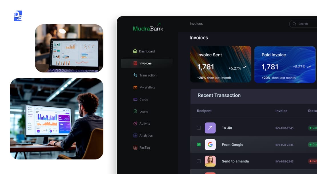
SaaS apps have become increasingly data-rich. So, sophisticated data visualization is no longer a niche feature. It is a critical component of the user experience.
This SaaS trend is all about transforming raw data into clear, actionable, and often beautiful visual insights. How? By using:
- Interactive dashboards and interactive infographics that help users understand complex information at a glance.
- Contextual charts that update in real-time.
- Giving users the ability to drill down into all details shared in these dashboards, infographics, and charts.
Such well-designed data visualizations make complex datasets accessible, reveal patterns, and support better, faster decision-making.
According to a study, interactive charts increase product adoption rate by around 35% and lower churn by 28%.
This makes these real-time data visualization charts a powerful tool for 60% executives who make deals based on data quality.
This is especially critical in CRM platforms design, where sales and support teams rely on clear dashboards and frictionless workflows to make fast decisions.
13. Command Palette Navigation
A command palette is a search-and-act bar, usually triggered by Cmd+K or Ctrl+K, that lets users jump to any page, run any action, or search any content without touching a mouse or navigating menus.
It started in code editors like VS Code and Sublime Text, built for developers who never wanted to leave the keyboard. SaaS products picked it up once teams noticed how much faster power users moved without hunting through nested menus.
Why it’s spreading beyond dev tools:
- It scales with product complexity, adding features doesn’t mean adding menu clutter, since everything routes through search
- It rewards repeat users, who memorize shortcuts and stop relying on visual navigation entirely
- It doubles as a discovery tool for less experienced users, since typing a rough idea of what you want to do usually surfaces the right action
Examples of command palettes done well:
- Linear’s command menu handles nearly every action in the app, and it’s become one of the tool’s most-mentioned features among power users
- Notion and Raycast both use this pattern as a primary navigation method, not a shortcut layered on top of menus
How we apply it at Design Studio UI/UX: On a recent SaaS dashboard project, we added a command palette after watching users lose time hunting through a five-level settings menu. Support tickets about “where do I find X” dropped noticeably within a month. It’s a small addition, but it changes how power users perceive the whole product’s speed.
14. Modular Design Systems
Modular design systems break a SaaS product’s UI into reusable, independently updatable components – buttons, cards, form fields, navigation instead of one-off screens built from scratch. When a component changes once, it updates everywhere it’s used.
This matters more as SaaS products scale. A tool with 5 screens can get away with ad-hoc design. A tool with 50 screens across web, mobile, and embedded widgets can’t – inconsistency compounds fast, and every new feature becomes slower to design and build without a shared component library.
Why modular design systems matter for SaaS specifically:
- New features ship faster once components already exist and are documented
- Design and engineering stay in sync, since both reference the same component library instead of redlining screens one at a time
- The product feels coherent even as different teams build different features in parallel
Examples of strong modular design systems in SaaS:
- Figma, Notion, and Linear all run on mature internal design systems, which is part of why they can ship new features without their interfaces feeling stitched together from different eras.
- Atlassian’s design system (used across Jira, Confluence, and Trello) is a well-documented public example of this approach at scale.
What are the Top Emerging Trends in the SaaS Industry in 2026 and beyond?
Important SaaS design trends shaping the future of softwares are AR/VR integration, predictive UI using AI, voice navigated tools, and AI generated UI.
SaaS innovation will not stop anytime soon. Looking ahead, here are some emerging trends that we think will reshape the SaaS landscape in the near future:
AR/VR in Enterprise SaaS
Get ready for augmented and virtual reality (AR/VR) to leap from gaming headsets into your SaaS workflows pretty soon. This trend, fueled by maturing hardware and software ecosystems, aims to make SaaS more immersive and contextual.
What AR/VR looks like in enterprise SaaS:
- AR overlays showing real-time data on machinery for field service tools (like PTC’s Vuforia).
- VR simulations for complex training and onboarding (platforms like Spatial for meetings or Microsoft Dynamics 365 Guides).
These design features can bridge the physical and digital, boost understanding and interaction, and drive SaaS adoption by making abstract data tangible and remote collaboration richer.
Predictive UI Using AI
Born from sophisticated recommendation engines and contextual awareness, this AI-driven trend proactively surfaces the right actions, content, or data before you even ask.
Examples of predictive UI in SaaS:
- A project tool suggesting the logical next task based on workflow patterns.
- A CRM highlighting leads poised to convert, as seen in early forms with Salesforce Einstein‘s recommendations.
Predictive UIs are growing in popularity due to advances in ML and user data analysis. And, it is promising to make SaaS adoption seamless by making tools feel ultra-intuitive.
Fully Voice-Navigated SaaS Tools
Prepare to talk to your SaaS tools a lot more. As voice recognition tech hits near-human accuracy, fully voice-navigated SaaS is becoming viable.
Early glimpses of this already exist in SaaS tools like Microsoft Copilot. Increasing voice capabilities in SaaS will lower interaction barriers, especially for mobile or field use.
AI-Generated UI Based on User Preference
This is the ultimate frontier of personalization in SaaS: SaaS interfaces getting dynamically generated or adapted by AI based on individual user profiles, roles, and real-time behavior.
Combining generative AI (think large language/visual models) with adaptive design systems, the idea is to craft truly custom SaaS UIs on the fly.
While still nascent, experiments with AI-driven dashboards and low-code tools generating interfaces from prompts hint at a future where this SaaS design trend is normalized.
How Are Leading SaaS Companies Implementing These Design Trends?
In 2026, top SaaS design brands use minimalism, micro-interactions, AI personalisation, etc. to simplify site navigation and user actions.
Top SaaS examples include Notion, Grammarly, Linear, and Figma which ensures design actually helps people get their work done.
Theory is great, but seeing trends in action is where the real learning happens. Analyzing how top SaaS products implement design principles provides invaluable, practical insights.
It shows what works, why, and how to avoid common traps.
Let’s dissect a few standouts:
Notion:
Minimalism, Micro-interactions & Human-Centricity
Notion is a clinic in focused design.
Its UI champions minimalism, clean, spacious, with a clear hierarchy that cuts cognitive load. But the UI is not fully sterile.
Subtle micro-interactions (smooth drag-and-drop, responsive hovers) make it feel polished and alive.
It also nails emotional and human-centric design through playful illustrations and customizable spaces that allow users to inject their own personality.
This blend of SaaS design trends drives massive user loyalty for Notion.
Grammarly:
AI Personalization & Predictive UI
Grammarly lives and breathes AI-driven personalization. Its core value proposition relies on understanding user context (writing style, tone, audience) to provide tailored suggestions.
So, it has a predictive UI that dynamically surfaces relevant corrections.
Its unobtrusive integration across platforms showcases excellent implementation of contextual assistance. Grammarly’s UI/UX design makes AI feel like a helpful + valuable partner.
Linear:
Dark Mode, Minimalism & Advanced Micro-Interactions
Linear is revered for its speed and focus. Its design is built on minimalism and hyper-efficiency.
Its meticulously crafted Dark Mode is a prime example of balancing aesthetics with readability and reduced eye strain.
The entire UX is also packed with slick, purposeful, advanced micro-interactions – keyboard shortcuts, command menus, instant feedback loops, and more.
These micro-interactions cater to power users (mainly product teams) and make the tool feel incredibly fast and responsive.
Figma:
Collaboration, Mobile-First Thinking & Accessibility
Figma has redefined design collaboration.
Its platform is inherently community-driven, built for real-time co-creation. It embodies mobile-first SaaS design thinking by offering robust experiences across web, desktop, and mobile (viewing/commenting).
Figma has also intensified its focus on Accessibility as Core. It now allows designers to create more inclusive products.
The tool itself is now usable for a wider audience thanks to a simplified design system.
To truly appreciate these, dive into their interfaces yourself or explore showcases on platforms like Dribbble or the Figma Community.
How to Apply These SaaS Industry Trends to Your SaaS Product
To use SaaS design trends safely, research what users need, ensure the look fits your brand, update the design system, and always test to make sure the new style doesn’t impact app performance.
Inspired? Good. Now, let us get practical. Applying these trends is a strategic process:
Start with Research
Do not guess what users want. Dive deep into your user data.
Research methods and tools to use:
- Set up user testing sessions (remote or in-person) to observe behavior directly.
- Analyze product analytics (Google Analytics, Mixpanel, Amplitude) to see where users engage or drop off.
- Use heatmaps and session recordings (Hotjar, FullStory) to visualize interaction patterns.
Research shows teams that combine behavioural analytics with real user conversations find 3x more usabilities issues than those just looking at numbers.
They use Hotjars heatmaps, live interviews, etc. to observe user behaviour and make redesign choices.
It tells you which trends (for example, personalization for complex workflows, dark mode for heavy users) will actually solve problems and add value for your audience.
Choose Trends that Vibe with Your Brand
Not every trend fits every product. Map potential trends against your established brand persona and user profiles. Consider a minimalist, dark-mode-first approach for better results.
Ensure the trends you adopt feel authentic and enhance, not dilute, your brand identity.
Is your brand playful and creative, or serious and data-driven? Does your SaaS serve tech wizards or artistic souls?
Level Up Your Design System
This is where the rubber meets the road. Integrate chosen trends systematically. Update your design system (likely in Figma or similar tools) with new components, patterns, and guidelines.
Key design system updates to make:
- Define design tokens for colors (supporting light/dark modes), spacing, typography, and interaction states.
- Document how micro-interactions or personalization rules should behave.
This ensures consistency, streamlines development handoff, and makes iterating much faster.
Bring in the Cavalry
Sometimes, you need an outside perspective and specialized skills.
Partner with top SaaS design agencies for deep expertise in AI implementation, complex data visualization, or advanced accessibility.
They can:
- Conduct audits
- Facilitate workshops
- Ensure your trend adoption is technically sound and strategically aligned
Do not be afraid to invest in expertise.
Usability Trumps Trendiness (Always)
This is the golden rule.
Test every trend and never sacrifice core usability for the sake of a cool visual effect or the latest fad. A slick animation that slows down loading or a hyper-personalized dashboard that confuses users is a failure.
Rigorous usability testing must validate that any new trend improves the user’s ability to accomplish their goals efficiently and effectively. If it hinders, iterate or discard.
Function before form, always.
What Are the Common UX Design Mistakes to Avoid When Following SaaS Trends?
Most common UX design mistakes in SaaS products are adding heavy visual content, ignoring user tests, accessibility, responsiveness, and consistency across multiple devices.
Chasing trends can lead you astray. Watch out for these common blunders:
Blindly Following Without Testing
Slapping on a trend because it’s popular without validating it with your users is a recipe for disaster. What works for Notion might annoy your user base.
Always prototype and test with real users first. Data, not assumptions, should drive all UI/UX design decisions.
Overdesigning & Killing Performance
Heavy animations, complex 3D visuals, or excessive micro-interactions can look cool but bog down performance, especially on mobile or slower connections.
Google research shows if your app takes more than 2.5 seconds to load, 24% more people will leave immediately.
Every 0.1-second delay added by unoptimised designs and animations can hurt your conversion and sales figures.
Hence, designers must-
Prioritize loading speed and responsiveness. Optimize assets, use efficient code, and ensure visual flair does not compromise the core experience.
Forgetting Accessibility
Implementing a trendy dark mode with poor contrast or complex interactions that are not keyboard navigable isn’t just bad design; it excludes users and risks legal trouble.
Weave accessibility (WCAG guidelines) into your process from the start. Test with screen readers, check contrast ratios rigorously, and ensure keyboard support. It is non-negotiable.
Creating Cross-Device Chaos
Applying a trend inconsistently across desktop, web, and mobile confuses users and can shatter brand trust.
A seamless experience requires responsive design principles and a unified design system. Ensure interactions, layouts, and brand elements feel coherent, regardless of the screen size.
Conclusion
Trends like AI-generated interfaces and AR-driven workflows are not mere features, they are gateways to productivity gains, user loyalty, and market dominance.
Yet, their value lies not in adoption alone, but in execution.
This is where SaaS design services become indispensable. The complexity of balancing predictive UI, voice navigation, and accessibility demands more than technical skill.
It requires a deep understanding of cognitive ergonomics, behavioral analytics, and cross-platform coherence.
At Design Studio UI/UX, that’s exactly what we offer, Let our UI/UX design agency guide you beyond the hype and merge cutting-edge trends with battle-tested usability principles.
The future belongs to SaaS platforms that recognize design as a living ecosystem, not a static layer. Let’s build that future together.
FAQ’s About SaaS Design Trends
What are the top SaaS design trends in 2026?

AI personalization, emotional and human-centric design, micro interactions, dark mode, mobile-first design, accessibility, and gamification are the top SaaS design trends. This also includes interactive visuals, voice UI, chatbot integration, minimalism, and data visualization.
Why is mobile-first design important for SaaS?
Mobile first design can meet user demand for anytime access, which can directly improve user engagement and retention rate. People can easily check dashboards, charts, and complete their tasks on their phones. According to research, more than 60% traffic comes from mobile devices.
How does gamification improve SaaS user adoption?
Gamification makes boring tasks fun that keeps users coming back to the website, thereby improving product adoption rate. It uses progress bars, points, leaderboards, and badges to make onboarding and navigation process interactive and engaging.
What are the most common SaaS UX design mistakes?
Most common SaaS UX design mistakes are adding heavy visual content, ignoring user tests, accessibility, responsiveness, and consistency across multiple devices. If you want to build a successful design, always puts the user’s task ahead of being trendy or pretty.
How do data visualizations improve SaaS decision-making?
Data viz turns heavy data into easy to understand insights for better decision making. It helps spot trends, catch anomalies, and track key performance metrics in real-time. According to a research, interactive charts increase product adoption rate by around 35% and lower churn by 28%.


