Library Mobile App Design
For Bookish

- Bookish
- Mobile App
- UI/UX Design
- 1 UX Researcher & 1 UI Designer
- 2 Months
About Bookish
Bookish was conceived during the period when the pandemic was on a decline. It was the period when the opportunity to get back to our old habits and the craving to go here and there, to do this and that were amplified. But all we could do was to be confined within the walls of our houses. Amongst the other necessities that could be accomplished online, we realized that there was another area where technology, specifically library mobile app design, could help: renting books from libraries.
For bookworms as well as for those who needed books from the library for work or for academic purposes, the pandemic had posed a huge setback. To make sure that contactless services continue even in the wake of the lockdown, we planned to try and design a library mobile app that would help people to request books from the comfort and safety of their homes.
Challenges
Managing a library system has always been a laborious job. And the same challenges were applicable to the online system as well.
These included:
- Seamlessly connecting people with the nearest local libraries
- Keeping the list of books and their availability updated online
- Delivering books to and fro seamlessly
- Making sure that books were not overdue or that the subscription wasn’t misused
Our Approach
Discover
It is usually assumed that technology and online services are for the youth and middle-aged. But with the right planning, these can be easily used by the elderly, too, if they are a planned part of the target audience, that is.
Libraries are used by people of all demographics. So, to make our application inclusive, it needed to be simple, intuitive and to-the-point.
Define
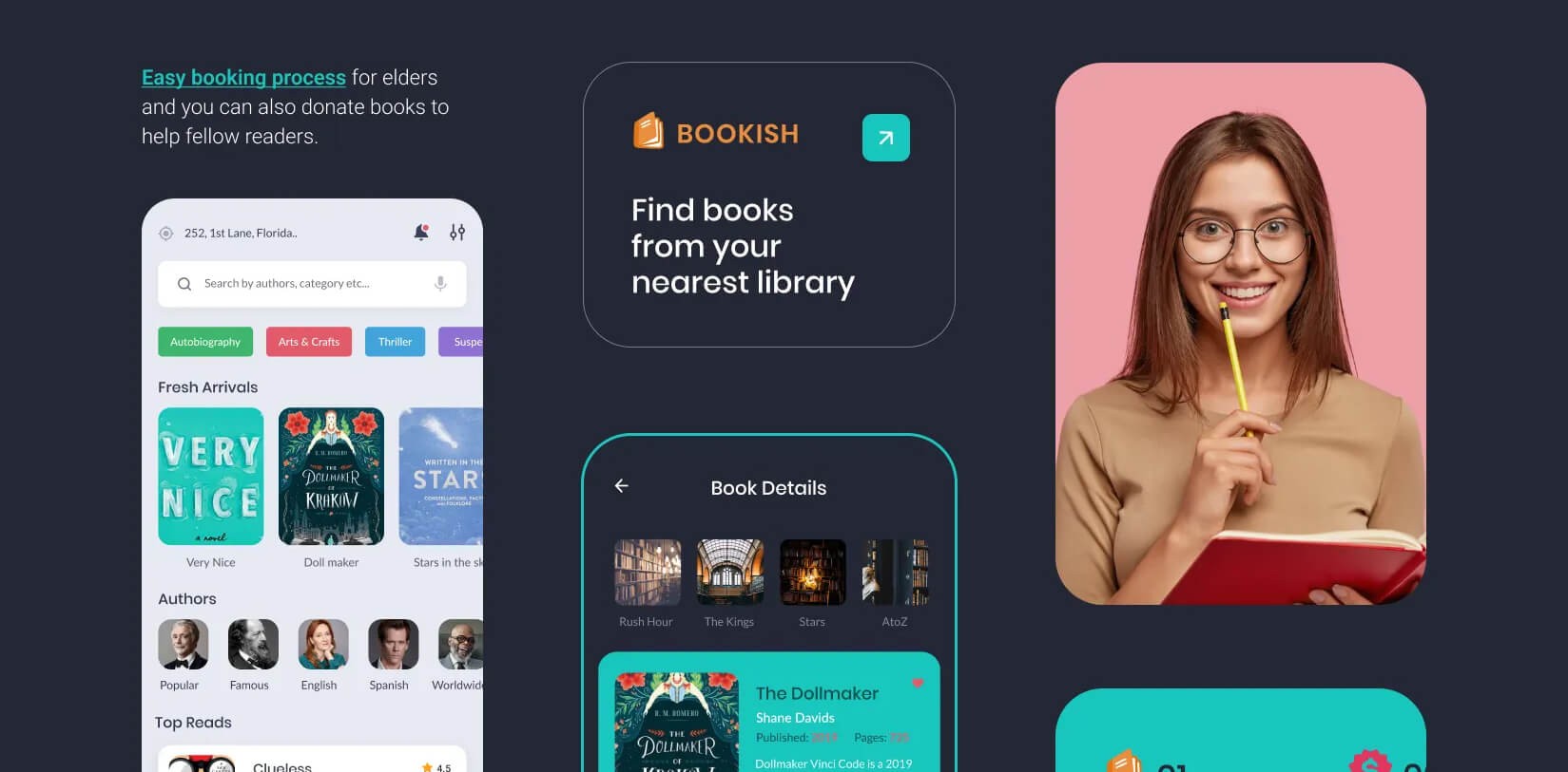
While finding and reading books is the main concern, we realised that readers usually contribute a lot more than just recommendations and reviews. So, we included an option where people can donate books to libraries if they wanted. Registered libraries would be notified about the book, and they can mutually decide which one would require the book in their stock.
Design Highlights
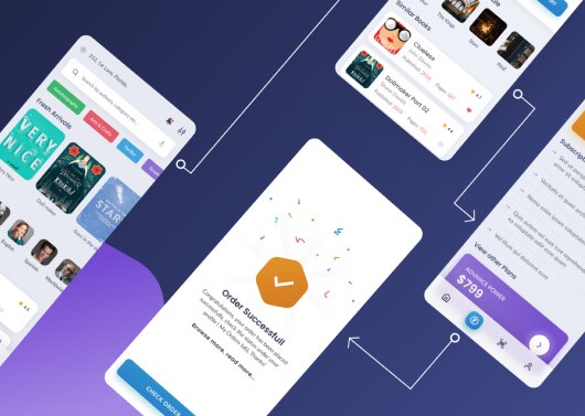
Without trying to incorporate fancy graphics or interactions, we kept the entire experience plain and simple.
The basic concept here was that people who are looking for books wouldn’t be interested in any other diversions. So, without any complicating matters, let’s give them what they want.
Also, since we are also including people from all age groups, all educational backgrounds as well as those from areas with low bandwidth, it would be best to keep the app lightweight.
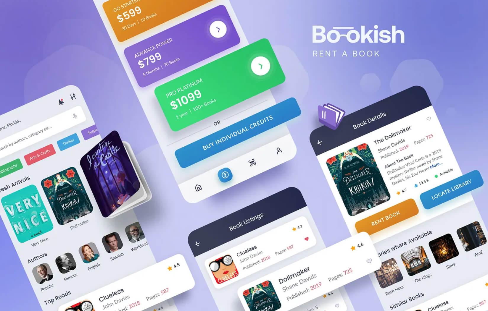
The new Bookish App stands as a dynamic, futuristic digital platform that:
- Reflects the brand’s innovative spirit.
- Offers an immersive and engaging experience.
- Features 50+ interconnected pages, seamlessly designed for easy navigation.
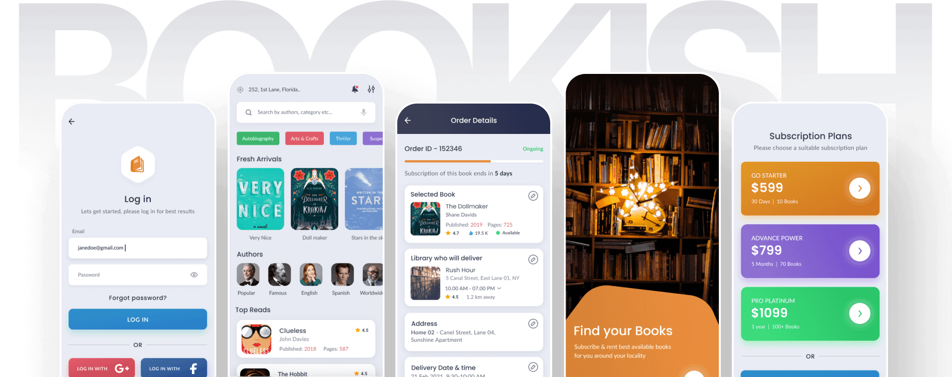
Final Product Showcase
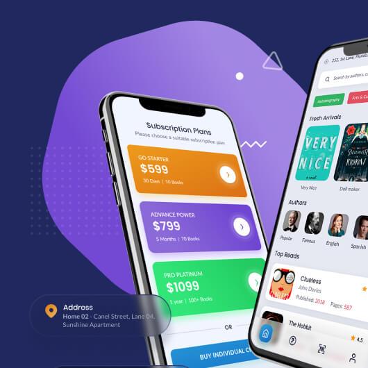
Bookish became a seamless digital bridge between local libraries and readers of all ages. Designed with simplicity at its core, the app enables users to browse, rent, and return books — all without stepping outside their homes. Whether it’s a student looking for academic material or an elderly reader craving their next novel, Bookish offers an intuitive experience for everyone.
From real-time book availability to doorstep delivery and even book donations, every feature was built with clarity and inclusivity in mind. The result? A lightweight, no-frills mobile app that makes access to libraries not only possible during difficult times but effortlessly enjoyable — pandemic or not.
Future Plans
As of now, the library mobile app stands as a monolith with only the mobile application for the customer’s end. We plan to provide a complete library mobile app design solution by creating the web application on the libraries’ end as well. Research has already started, and we hope to see the other side of this library mobile app very soon.


