Sales Engagement Platform
(SaaS app) for Ampel

- Ampel
- SaaS
- UI/UX Design
- 1 Researcher & 1 UX Designer
- 2 Months
About Ampel
Sales processes shouldn’t be messy, and yet most often they are. When the process gets messed up, it brings the entire system down with it, directly affecting the ROI.
But with the proper automation system, things can start moving to the sunny side.
Enter Ampel, a sales engagement platform designed for the glorious purpose of making the efforts of people in the sales team turn into something really productive.
Goal of the Design
The job of a salesperson consists of multiple tasks assigned for multiple clients. While some include a simple follow up, others include detailed conversations or closing deals. Missing any one of these or, God forbid, sending the wrong mail to the wrong person can lead to the collapse of days of hard work, like a row of dominoes collapsing.
Ampel needed to make sure that as soon as the user starts the system, they are greeted with an organised list of tasks for the day, and are walked through the entire process.
So, right from “Good morning, user, these are your tasks for the day” to “Okay, that deal is done!” – everything needed to be in the perfect sequence, for every task.
Challenges
Our job was to make sure that the flow was seamless to every tiny detail, and that the UI was as intuitive as possible. A day in the life of a salesperson is already burdened with lots of mind-boggling responsibilities. We shouldn’t add to those, right?
The biggest challenge, however, was something else:
Long before Ampel was even conceived, two powerful competitors had already anchored themselves to the market: Outreach and SalesLoft. Outshining them needed an approach that was completely different and yet very useful.
Our Approach

Discover
Ampel’s target audience consists of agencies that have a dedicated sales team for lead generation and conversion; basically, B2B sales teams selling subscription products.
We collaborated with the client to know user pain points and expectations. The client assisted and guided us to understand the product’s purpose and the difference it expects to make in the market.

Define: Brainstorming and Brand Harmony
We asked the client what made Ampel different from its strong competitors, and the answer showed us the different approach that Ampel needed: Funnels!
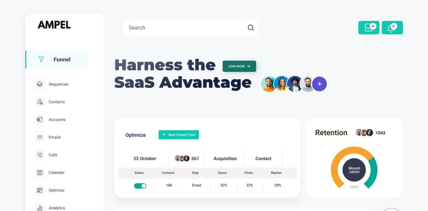
The difference from its competitors lies in the fact that instead of putting up a board that lists the tasks scheduled for the day, Ampel guides the sales person through the conversion funnel. So, it not only tells the sales person what to do for the day but also walks them through the necessary steps, so that nothing goes amiss.
The project began with a thorough discussion with the client and a Miro board holding up precious notes on the flow of the application.
Design Highlights

This was our first experience with a sales engagement platform, and we had to do quite a lot of homework to understand how the process works, what pain points such an application solves, and to learn a lot of sales terminology!!
We decided to take baby steps for this project, creating wireframes for 1-2 screens, and reviewing with the client to make sure that we are on the right track. Eventually, after a bit of to and fro, we got the hang of it. It was our turn to take the wheel, and pour our experience and knowledge into the project.
The new Ampel Platform stands as a dynamic, futuristic digital platform that:
- Reflects the brand’s innovative spirit.
- Offers an immersive and engaging experience.
- Features 50+ interconnected pages, seamlessly designed for easy navigation.

Final Product Showcase
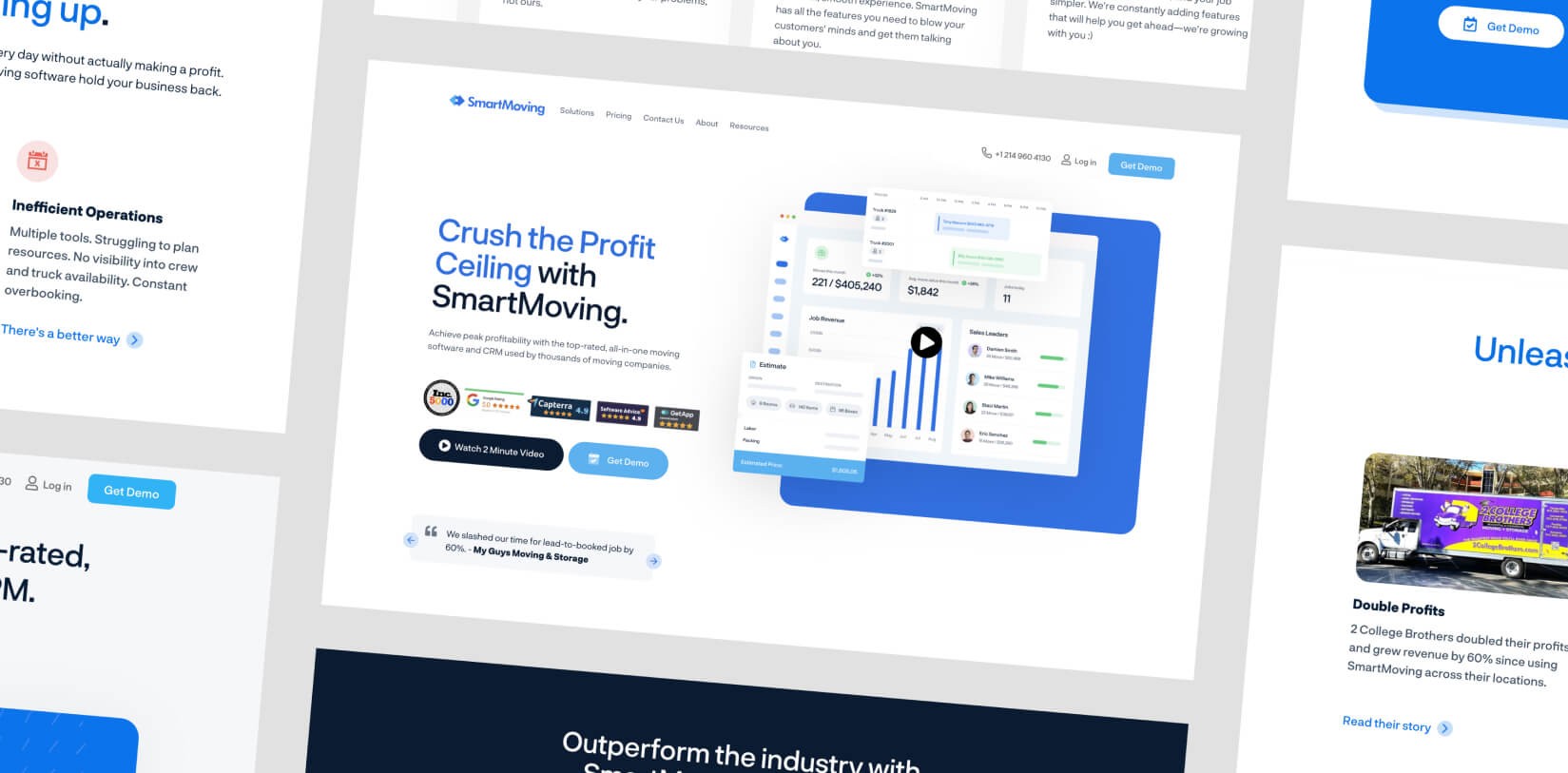
Ampel emerged as a clean, intuitive, and conversion-focused sales engagement platform that doesn’t just list tasks — it guides users through every step of the sales funnel. Every interaction was designed to feel purposeful — whether it’s viewing priority leads, sending personalized follow-ups, or tracking funnel progress. The result? A platform that doesn’t overwhelm but empowers. In a space dominated by giants, Ampel now stands out with a human-centered design that turns complex sales workflows into seamless, productive journeys.


